Summary Panel
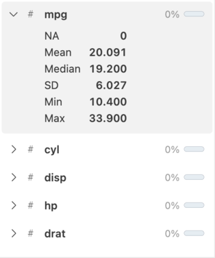
The summary panel displays a scrollable list of all column names with an icon representing the data type. Each column will have a sparkline histogram or frequency table of the column data. Missing data for the column is displayed as both an inline bar graph and a percentage.
Select the icon next to the column name to expand the column and see additional summary statistics and a larger sparkline.
Double-click a column name to bring the column into focus in the main data grid. This allows for quick navigation of wider datasets.
Loading indicators
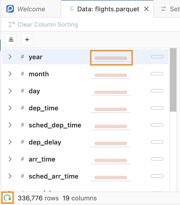
When first opening the Data Explorer or using features like scrolling, filtering, or sorting, you may see loading indicators in the summary panel and in the bottom left corner of the window:
Tooltips
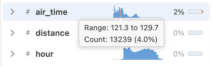
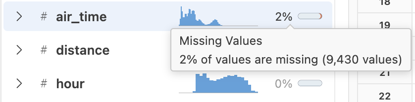
The summary sparkline charts and missing data indicators display tooltips when you hover over them:
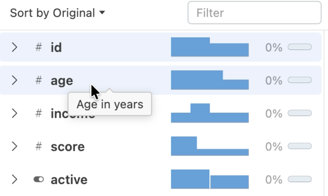
When you hover over the data type indicator next to the column name, a tooltip shows the name of the column data type:

If the column has a label, the tooltip includes the label:
Search and sort columns
Search columns
To search for specific columns in the summary panel, type part of a column name into the summary panel search bar. The summary panel will display columns that match any part of the search text. Searching changes the summary panel display but does not affect the main data grid.
Sort columns
To sort columns in the summary panel, select one of the following options from the sort dropdown:
- Sort by original: Display columns in their original order
- Sort by name, ascending: Sort column names A to Z
- Sort by name, descending: Sort column names Z to A
- Sort by type, ascending: Sort data types alphabetically (float, integer, string)
- Sort by type, descending: Sort data types reverse alphabetically (string, integer, float)
Sorting changes the summary panel display but does not affect the main data grid.
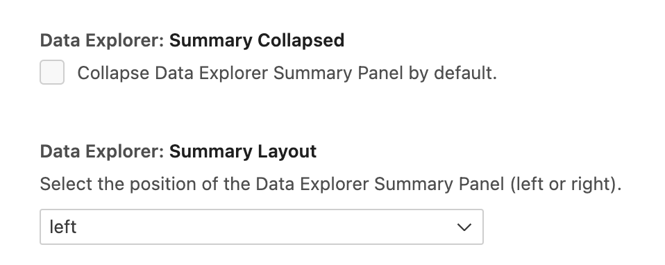
Panel layout and settings
You can collapse or expand the summary panel by selecting the / button or by dragging the grid and summary panel divider.
You can also place the summary panel on the left or right side of the Data Explorer using the Positron Data Explorer: Summary on Left or Positron Data Explorer: Summary on Right command.
You can change the default settings for dataExplorer.summaryCollapsed or dataExplorer.summaryLayout in Positron settings: