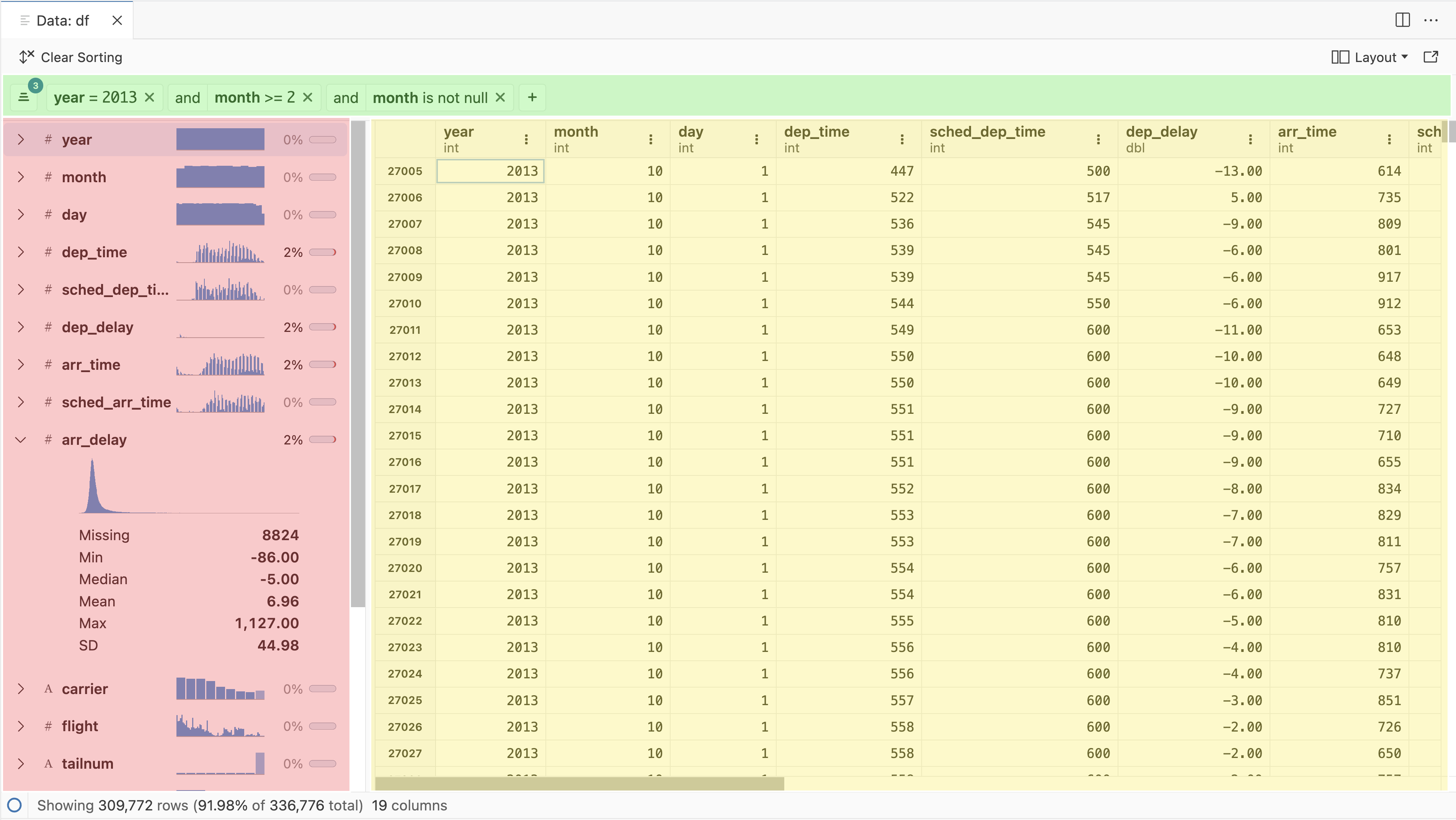
Data Explorer
The Data Explorer is designed to complement code-first exploration of data, allowing you to display data in a spreadsheet-like grid, temporarily filter and sort data, and provide useful summary statistics directly inside of Positron. The goal of the Data Explorer isn’t to replace code-based workflows, but rather supplement with ephemeral views of the data or summary statistics as you further explore or modify the data via code.
The Data Explorer can be used to view raw data files (CSV, Parquet, etc.) in your Positron workspace as well as dataframes in your active Python or R sessions.
The Data Explorer has three primary components, discussed in greater detail in the sections below:
- Data grid: Spreadsheet-like display of the individual cells and columns, as well as sorting
- Summary panel: Column name, type and missing data percentage for each column
- Filter bar: Ephemeral filters for specific columns
Opening the Data Explorer
There are a few ways to open the Data Explorer. If you want to look at data you have loaded into memory already, you can navigate to the Variables Pane and click on the table icon for a specific dataframe object.
Using code or the console, you can also run one of the following commands:
- In Python:
%view dataframe label
- In R:
View(dataframe, "label")
In Python, the %view
magic can also be used with expressions, for example %view df[df['column'] > 10]
. In R, the View
function can be composed with expressions using pipe syntax:
|> mutate(doubled_column = column * 2) |> View() df
Directly opening .csv
, .tsv
, and .parquet
files (using DuckDB) is supported by clicking on a file in the File Explorer or using the Command Palette. GZIP-compressed CSV files ending in .gz
can also be opened. We may add support for more file types in the future.
Each Data Explorer instance watches the underlying data for changes, so if you edit a data file or modify an in-memory dataframe, the changes will be reflected in the Data Explorer. Depending on the size of the dataset, when first opening the Data Explorer or using its features (like scrolling, filtering, or sorting), you may see loading indicators in the summary pane and in the bottom left corner of the window:
Supported data frame libraries
pandas and Polars DataFrame
objects are supported in Python, and data.frame
, tibble
, and data.table
are supported in R. Based on user feedback, we may add support for other libraries that expose a tabular data interface.
Opening CSV files as plain text
After opening a CSV file in the Data Explorer, if you need to view the file in the text editor, click on the “Open as Plain Text File” option in the top action bar:
Data grid
The data grid is the primary display, with a spreadsheet-like cell-by-cell view. It’s intended to scale efficiently to relatively large in-memory datasets, up to millions of rows or columns.
Each column header has the column name above the data type, which is dependent on the backend type (language runtime or DuckDB). At the top right of each column, there is a context menu to control sorting or to add a filter for the selected column. Resize columns by clicking and dragging the column’s borders.
Row labels default to the observed row index, with a zero-based index in Python and a one-based index in R. Alternatively, pandas
and R users may also have rows with modified indices or string-based labels.
For long strings or other data values that do not fully fit in a grid cell, you can see a tooltip containing the complete value by hovering over the cell:
Summary panel
The summary panel displays a vertical scrolling list of all of the column names and an icon representing their respective type. It displays a sparkline histogram or frequency table of that column’s data, and also displays the amount of missing data as both an inline bar graph and an increasing percentage. If you click on the carat symbol for a column, it will expand to show additional summary statistics and a larger sparkline.
The summary sparkline charts and missing data indicator display tooltips when hovered over:
If you hover over the data type indicator next to the column name, you will see a tooltip showing the name of the column’s data type:
Double clicking on a column name will also bring the column into focus in the data grid, allowing for quickly navigating wider data.
The summary panel can be collapsed by dragging the grid and summary panel divider to the edge or by clicking on the collapse button after hovering over the divider.
The summary panel can also be placed on the left or right side of the Data Explorer via the Layout control.
You can change the default settings for either dataExplorer.summaryCollapsed
or dataExplorer.summaryLayout
in Positron’s settings:
Filtering
The filter bar has controls to:
- Add, Show/Hide existing filters, or Clear Filters
- A + button to quickly add a new filter
- The status bar at the bottom of the Data Explorer also displays the percentage and number of remaining rows relative to the original total after applying a filter
When creating a new filter, you will first need to select a column either by scrolling the full list or searching across columns for a specific string. Once a column is selected, the available filters for that column type will be displayed. Alternatively, the context menu in each column label of the data grid also allows for creating filters with the column name pre-populated.
Available filters vary according to the column type. For example, string columns have filter affordances for: contains, starts or ends with, is empty, or exact matches. Alternatively, numeric columns have logical operations such as: is less than or greater than, is equal to, or is inclusively between two values.
Sorting
To sort the data by a column’s values, open a column’s context menu from the top of the grid and click either “Sort Ascending” or “Sort Descending”:
To clear an individual column’s sort, click on the column header and select “Clear Sorting” from the context menu.
When a column is sorted, the column header will have an arrow pointing up or down indicating the sort direction. You can sort by multiple columns by opening the context menu for a second column and sorting it, too. The number next to the sort direction indicates the sort order of the column.
A Data Explorer can be sorted and filtered at the same time without any issues.
To clear all sorting, click on the “Clear Column Sorting” button in the top action bar:
Grid selection and copy-and-paste
The data grid has copy-and-paste capabilities similar to a spreadsheet. You can select:
- A single cell
- A rectangular range of cells
- One or more entire rows
- One or more entire columns
To copy a single value, click on the cell of interest and either press Ctrl+C (on Windows and Linux) or Cmd+C (on macOS). You can also copy using the right-click context menu:
To copy a rectangular range of cells, first click on a cell, then hold the Shift key and click on another cell to select the range of interest. Then either press Ctrl+C/Cmd+C or use the context menu to copy:
When you copy a rectangular range of cells, the values are copied along with the column names in tab-separated format to ease pasting into Excel or Google Sheets.
To copy whole rows or columns, click on the first row label or column label then either hold Shift and click on another row or column label to select a range, or use Ctrl+C/Cmd+C to select individual rows or columns, but not necessarily a range:
Like copying a rectangular range of cells, copying an entire row or column will include the column names in the tab-separated output.